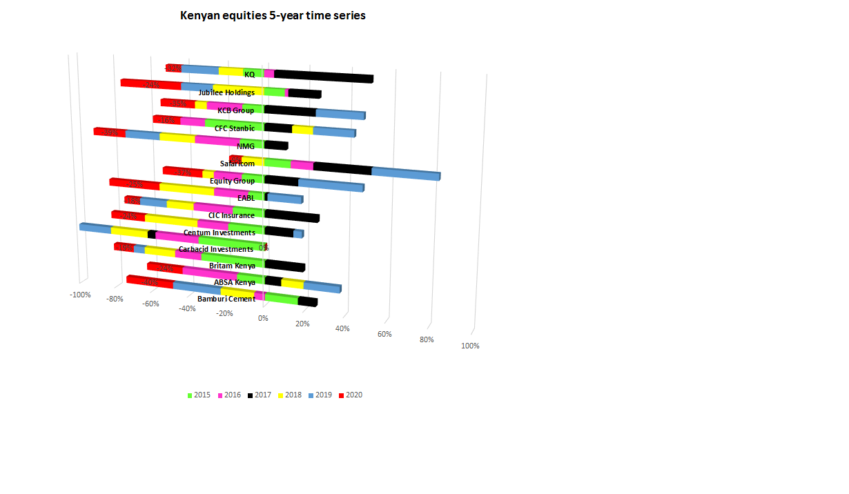
Covid-19 effect: Selected Kenyan equities 2015-2020
The green colored bars (Year-end 2015) show how the share price changed between end of 2014 and end of 2015. Bars to the right of the vertical PURPLE line (the 0% line) imply an increase in the stock price. Those to the left mean reduction in stock price. Most of the stock prices fell by end of 2015 and 2016. However, majority bounced back in 2017 as evidenced by the BLACK bars (end of 2017) to the right of the vertical line. 2018 (YELLOW) was a weak year, while 2019 (BLUE) was on the verge of recovery, especially the financial services and telecom. It will be observed that the RED bars (end of March 2020) at the extreme left of the graph can be attributed to Covid-19 pandemic. For example, Bamburi Cement price lost 40% (drop), Kenya Airways -32%, Safaricom -9%, Absa Bank -24%, EABL lost 25% and so on between 2019 and March 2020.
What does this mean to an investor? The average drop in stock price for this basket of stocks was about 20%. If an investor had this basket wealth of say US$5million at end of 2019, about US$1million had been wiped out in the three months of January, February and March 2020 alone. However, this is termed an unrealized “loss” until the investor has disposed off some of the stock. Even then, the disposal of stock at time of falling prices does not automatically mean that an investor has lost money. There is need to calculate the cumulative gains or losses by reference to the selling prices and the costs at which the different stocks were purchased.
For example, an investor may have bought 100,000 Safaricom shares at end of 2014 at KES 14.0 per share. By end of December 2019, each share had risen to KES 31.5. The investor had an unrealized gain of KES 1.75million (31.5-14)*100,000. However, the price had dipped to KES 28.8 at end of March 2020. There is a paper “loss” but in effect is a reduction in the cumulative gains from KES 1.75million to KES 1.48million (28.8-14)*100,000.
At what point should the investor decide to sell?

